Problem and Goal
It was late spring 2020 that we at Utilities and Public Administration, NIS Product Development, started pondering what to do with one of our flagship products Utility to Go (UTG). It needed a freshen-up, a new top coat as it were. What had started out as a simple tool for field work to coordinate network repairs, locate network objects and faults, and improve data integrity with immediate updates in the field had bloated over the years.
This product, well-established on the Finnish market, had a stable role in all of the major energy companies, but there hadn’t been much front-end resources spared for keeping the look-and-feel consistent. To fix this, we needed something that would allow for our two-person UX team to handle design work quickly and be confident that, once handed over to development, it would be easily executed according to the specs and design flows. This is where Modus came in. The goal was to test out with UTG, if Modus could get rid of heavy design work, unify styles, and get consistency. This would in turn solidify our plans of expanding the design system to the rest of the NIS product family.
But there was apprehension. Modus was still in beta and only a few teams within Trimble had implemented it. What we did have were the guidelines online that we could easily follow to utilize the library and the Sketch UI Kit for design work. The guidelines offered short descriptions of UI elements, their use and code snippets. Everything was there, but could we work with this? Can we customize the look even after adopting Modus? As you can imagine there were a lot of unanswered questions. To put some of these to rest we started evaluating components one at a time and took UTG screenshots to see how to replace elements with Modus equivalents. We noticed that with a little bit of work it was possible. This is when we got the green light from management.
Process

The plan was to execute the migration in the summer, mid-June to early August, when most were on a holiday and no pressing customer projects happened. For our initial planning phase we did it old-school printing screenshots of UTG on big A3 paper and making notes on the sides.
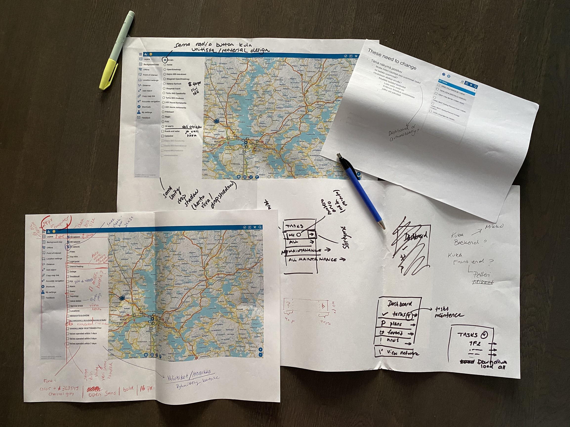
Next, we split UTG into different parts and UI components. Only after, with Jan Nyberg as the main front-end developer, did we go over these evaluating the engineering requirements and feasibility. To do this we had a simple Google slide deck where each component was examined in terms of functionality, form and use.
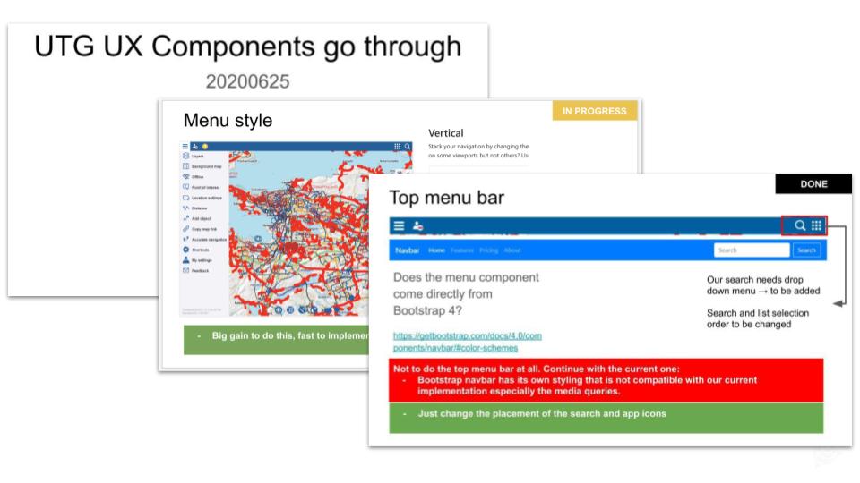
We marked green on the slides for pros and red for cons. In the far right corner we indicated the current status of implementation with simple “done," “in progress,” and “not started.” This way we went through all Modus components that would be replaced and its current status and future development in the Modus timeline. By doing this we got a clear understanding of what needed customization until Modus Beta caught up with us and what we could use straight out of the box.
Each week we had a meeting where we’d go through the progress. We had daily meetings when needed based on concerns and next steps. What we had planned in June to be executed in July turned out to be a little longer project running until mid-September. Partially this was due to getting needed assistance from people who’d been on a holiday and approvals for some of the more drastic changes. Also the final merge had to be done in a controlled manner with multiple developers checking that the main branch doesn’t break.
When it came to design work, I felt that Modus gave the terminology to be able to convey ideas easily to the rest of the team. What before had taken custom layout drawings in Sketch was now conveyed in wireframes and referrals to specific Modus components. Communication became easier, and the Modus Design System enabled this. Design work became more about thinking through user flows and less about simple UI components. By the end of the adoption process we could really start thinking about solving user problems, not just UI problems. It was thrilling to see this change in such a short amount of time.
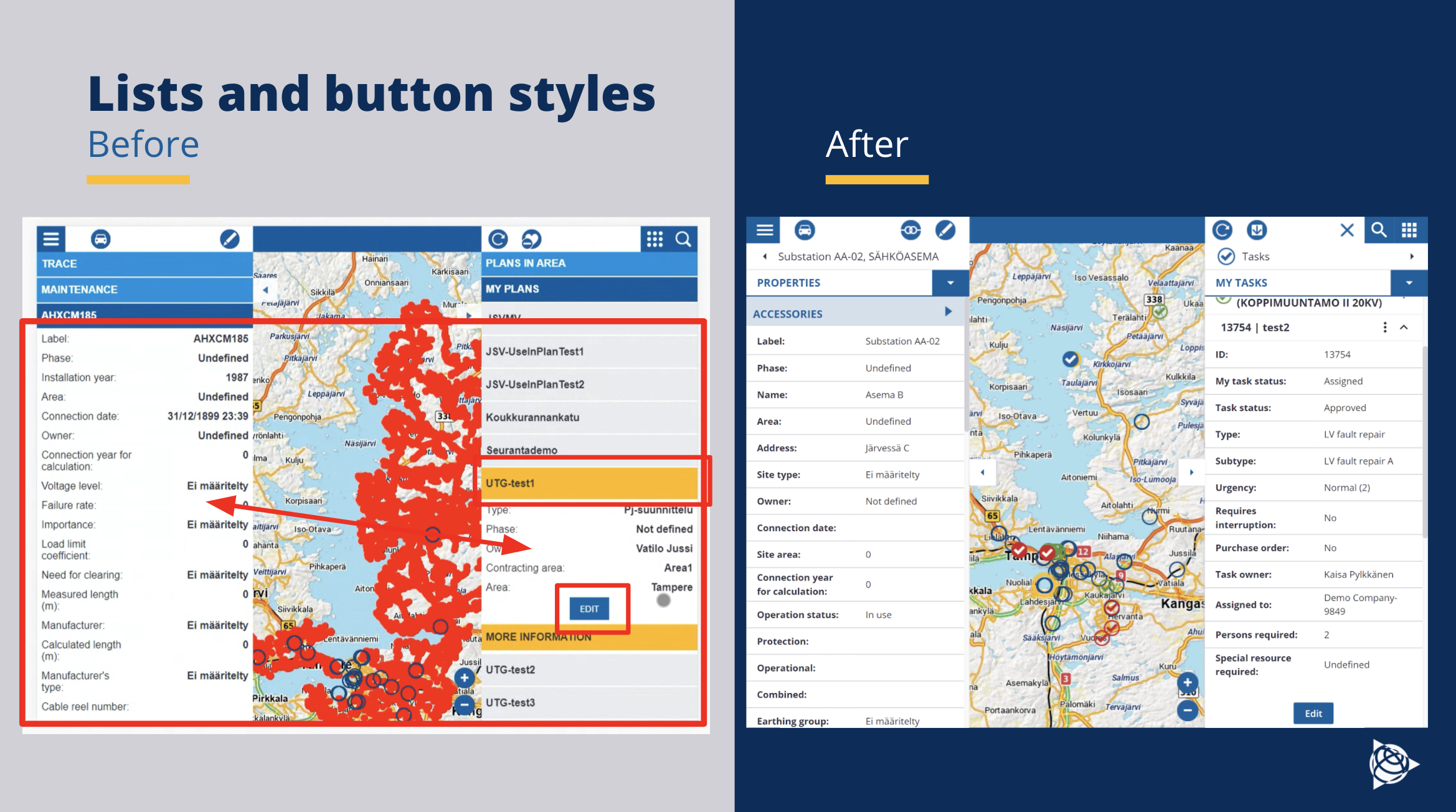
From the developer’s perspective, the whole process seemed a bit scary at first. To make so many changes to a critical application for our business at once in a short amount of time was causing unrest on the team. Some were concerned that the adoption might take so long that the changes would never get merged when customer project development continued in autumn. It was at this point that a decision was made to allocate resources to the review process after summer so that the changes could be properly reviewed and merged to the main development branch. With this, we guaranteed that the changes would not be left hanging and not risk the scenario where the main branch gets so far ahead that the Modus changes couldn’t be merged to it directly.
The Modus adoption development started by creating a new styling branch, and Modus was then added to it as a Node Module. We had some difficulties getting Modus properly added to the project at first. This was mainly due to the project’s setup. Even though UTG is written in Angular, it doesn’t use the built-in angular builds; instead, it’s built with webpack. At this time, we also didn’t have a CSS preprocessor in our project, so that needed to be configured as well. Setting things up was probably the most difficult part of the adaptation, development-wise. After everything was set up correctly changes could be done component by component. We started by changing the small and easy components in the application like the login component and the main-menu component and then moved on to the more difficult components. With each change end-to-end tests were run to make sure no features broke in the process.
Result
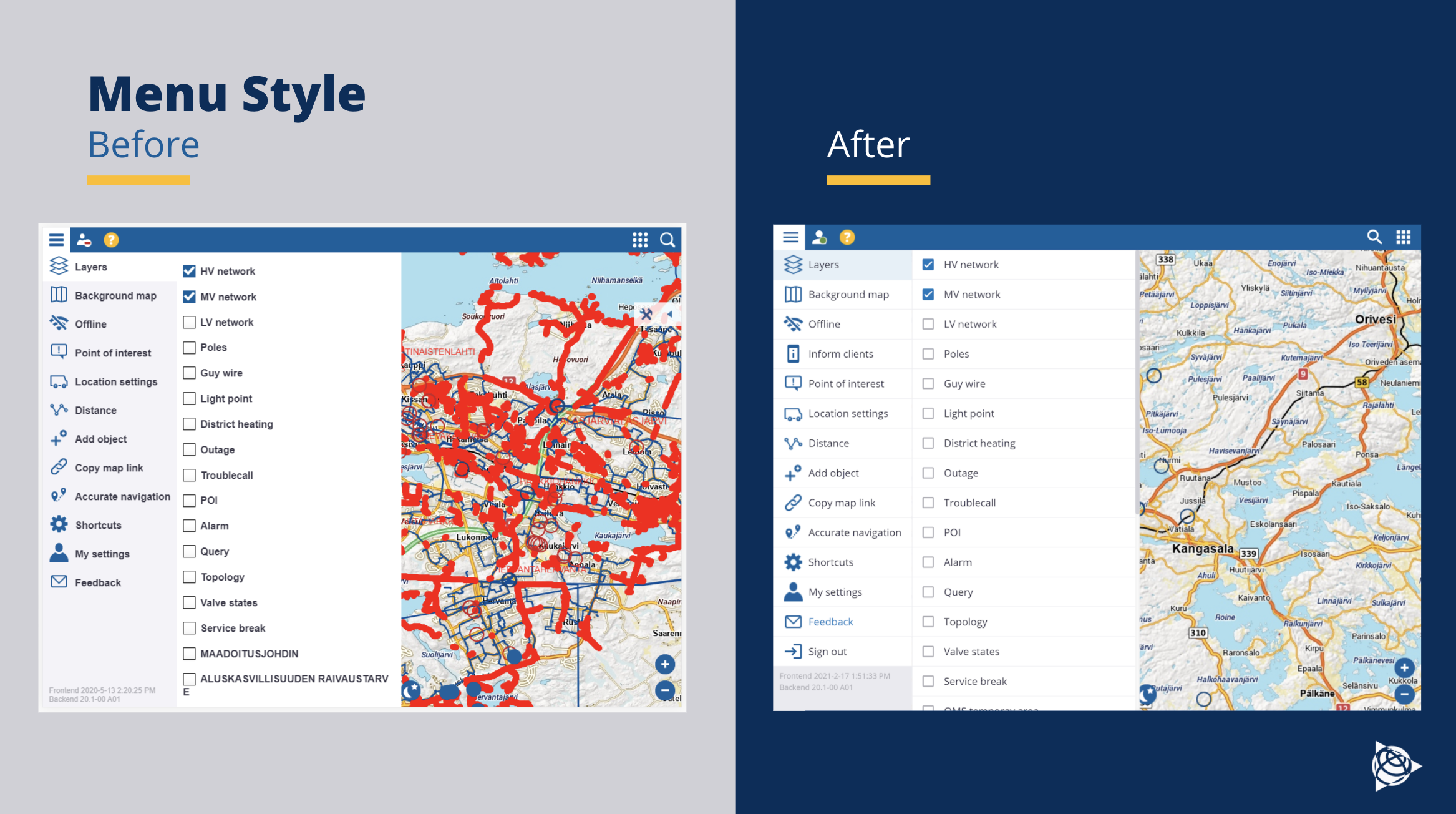
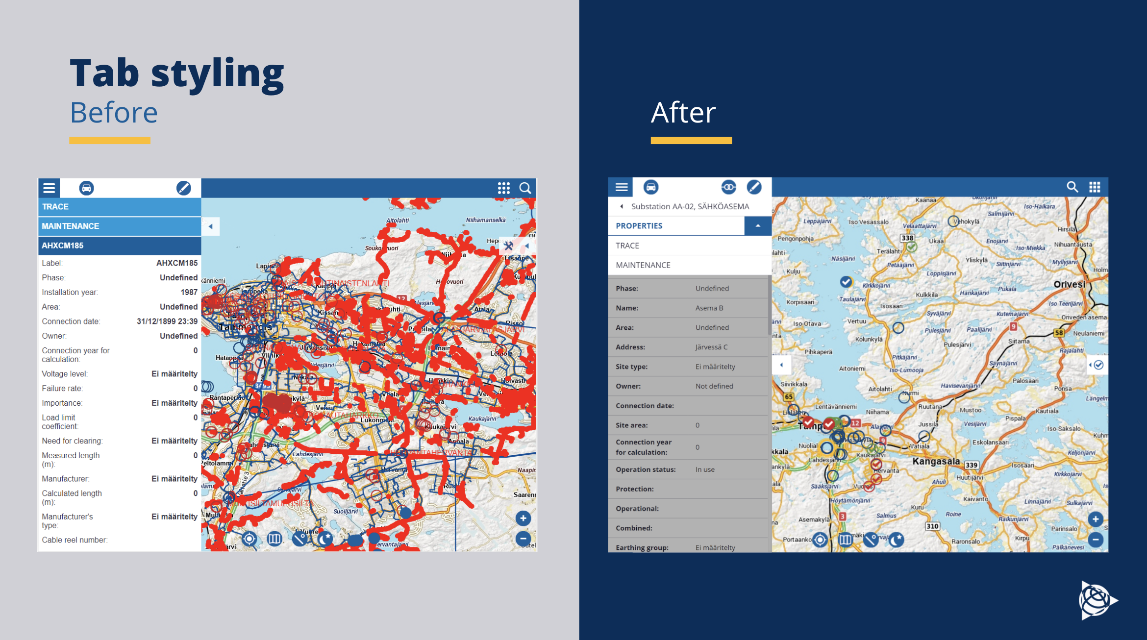
Looking back to summer of 2020 the Modus adoption has really paid off. Design work has gone from making custom layout designs in Sketch to easily discussing components and wireframing with developers. What used to take days/weeks takes hours if everyone is on the same page and talks Modus. We are able to hold more productive workshops and focus on user problems, not only UI problems. Design specs are not just handed over, hoping everyone is on the same page; Now there is more communication and understanding with the common tool.
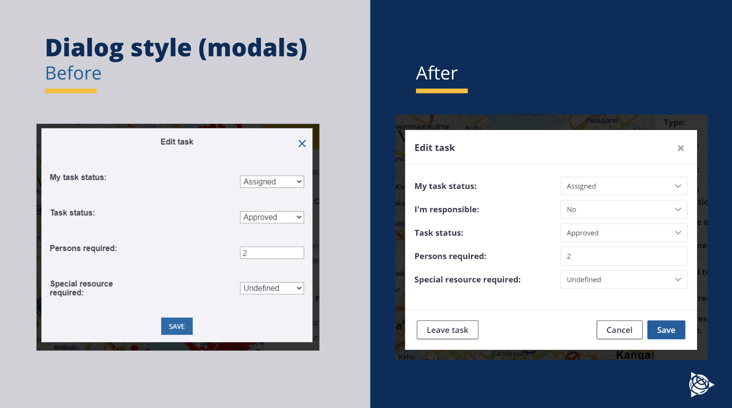
We are now adopting Modus into our other products, thus creating a unified product family that will have a coherent look-and-feel. Not only do our products look good to designers, but consistency will be beneficial for our users too. They will be able to understand and jump from one product to another with ease as the same components and logic follow. Overall from a design perspective Modus has been a win.
Development has also been accelerated with the help of Modus. Before, all our styles were completely custom-made, and we only had a few reusable components. Now with Modus, we can in many cases just use the ready-made components. It also helps that the UX specification is done with the same components that are at our disposal. Overall, it has been a huge help in our development. New features are now released with consistent and good-looking styles.
Conclusion
By fully adopting Modus (we achieved “Platinum Level” adoption) into Trimble Utility to Go, we have made our work easier for future development projects. With everyone talking in “Modus”, design specs are easy to do, developers know what and how they will implement them, and product managers know what they’ll be getting. The added bonus comes with continued updates to Modus. This allows for regular improvements of UI components and, as Modus is being developed throughout Trimble, the accumulated knowledge and experience of all the design and development teams encapsulates all this for anyone to use. Modus also keeps up with the current best practises and requirements, including the mandatory accessibility directives. It will help us keep our products looking fresh and easy to use without the extra work of doing everything ourselves. So, why not leverage this power?
Co-authored by Jan Nyberg